
MP&Co’s team are expert in the many disciplines required for modern marketing. From compelling design to engaging copywriting and up to the minute digital and web development. I can’t recommend them highly enough.
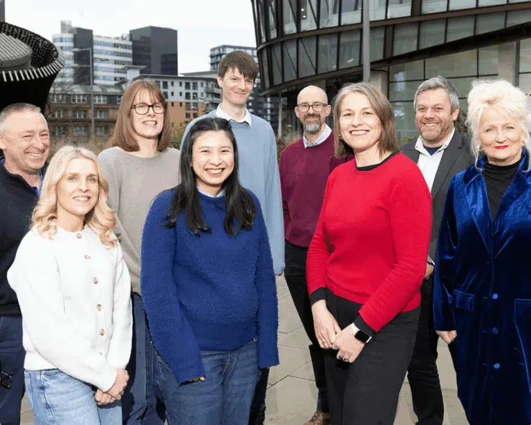
Matt Bland, CEO of The Money COOP
The Money COOP (formerly the Co-op Credit Union) is a not-for-profit, member-owned organisation. It has been helping people save and borrow ethically for over 26 years.
It began by serving Co-operative Group employees in Greater Manchester and now supports over 28,000 members across the UK. Since launch, it has loaned over £50 million, saved members more than £1.5 million in interest in the last four years and paid out £480,000 in dividends.
We kicked things off with a hands-on discovery workshop, digging into The Money COOP’s:
We also explored their current tone of voice and what future content should look like. Every part was treated as equally important to get a full picture for the rebrand.
As part of this, we invited the team to audit every live and potential channel – web, email, search, social, paid, print and member comms – to see where the new brand would need to flex.
Our workshop surfaced one pressing need: clear brand direction.
Many people still ask, “What’s a credit union?” Or, in this case, assume it’s only for Co-op staff or those in financial difficulty.
We had to help The Money COOP decide exactly who it wants to serve and how to speak to them. So the organisation is recognised as an ethical, competitive choice for everyone inside its wider common bond.
To do that, we were tasked with shaping one strong, unmistakable brand. Something instantly recognisable and clearly different from high-street lenders. At the same time, we needed to look at every way The Money COOP communicates to make sure they all told the same story in the same way.
We laid out three brand routes:
Guided by our research, the team chose route two. Together we shaped the new name – The Money COOP – and built a visual identity that keeps the ethical Co-op DNA while feeling open, modern and instantly recognisable to a wider audience.
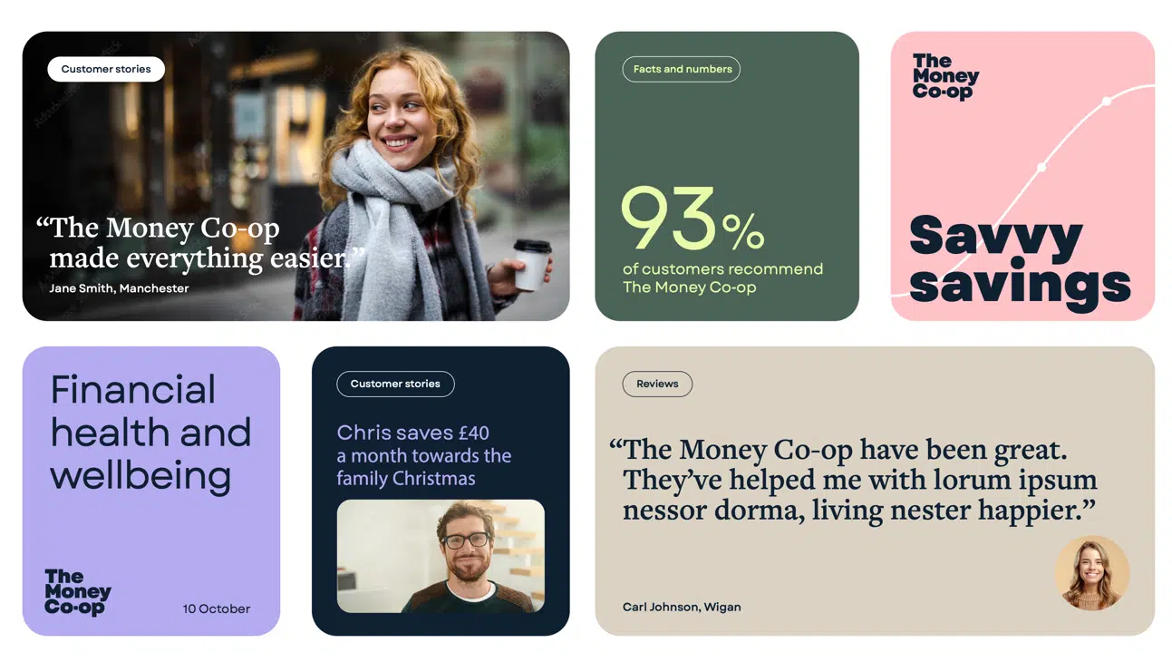
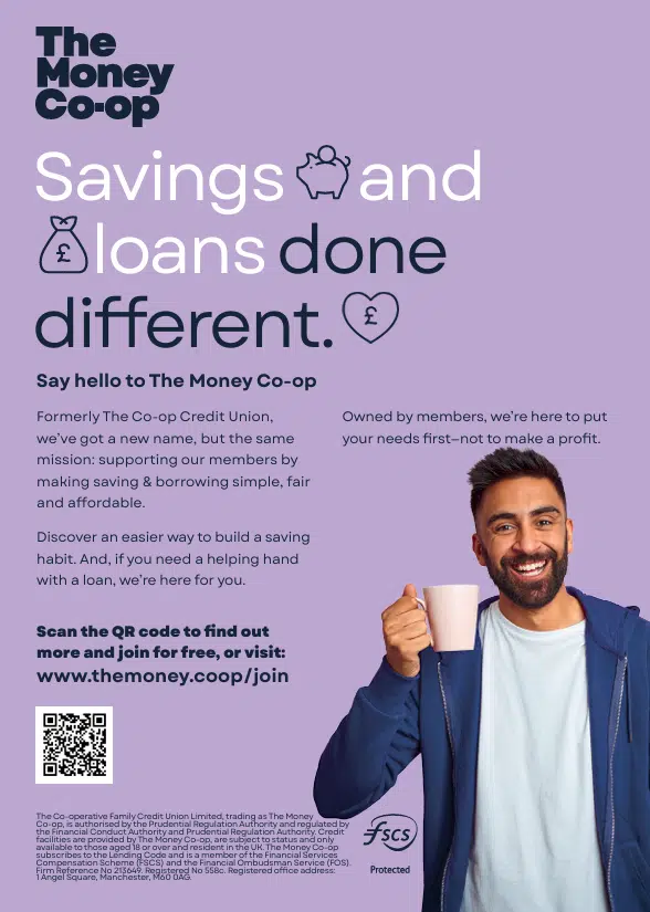
We gave The Money COOP a complete visual toolkit:
We built ready-to-use social templates – posts, covers and headers for every channel – plus an email newsletter layout that lets the team drop in content and hit send. Event banners and posters were next on the list.
Alongside the visuals, we wrote a distinct tone-of-voice guide. Three traits lead the way: ethical, accessible, people-focused. It keeps every word sounding unmistakably Money COOP.
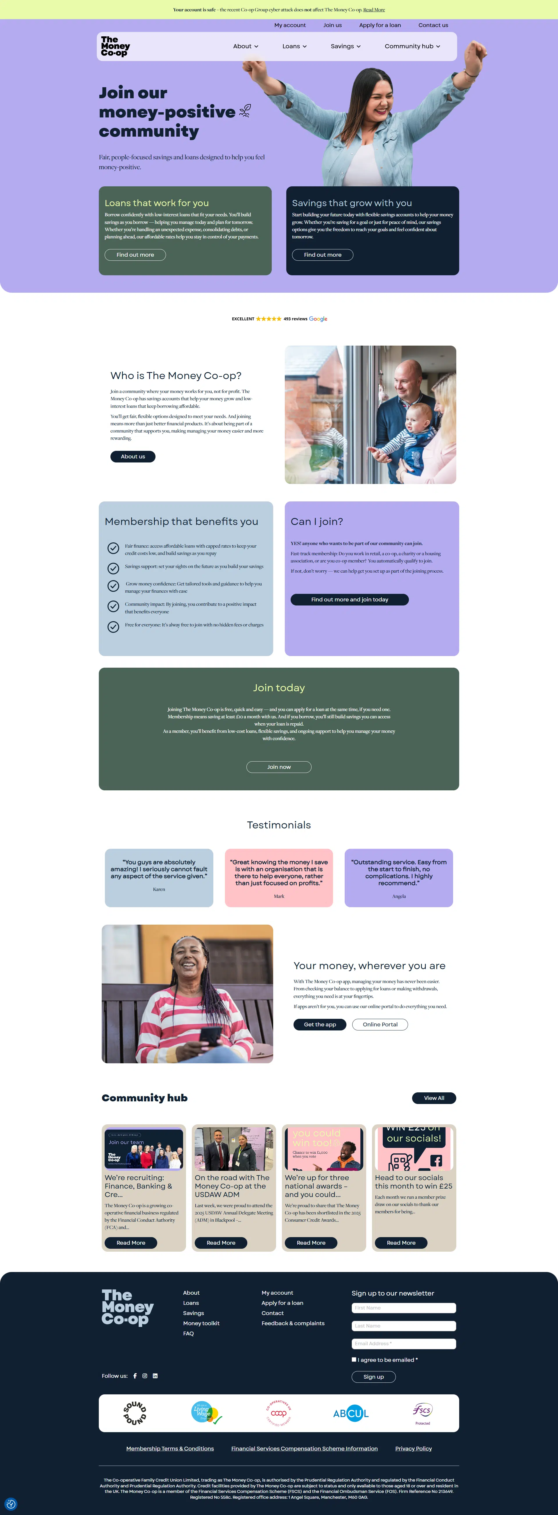
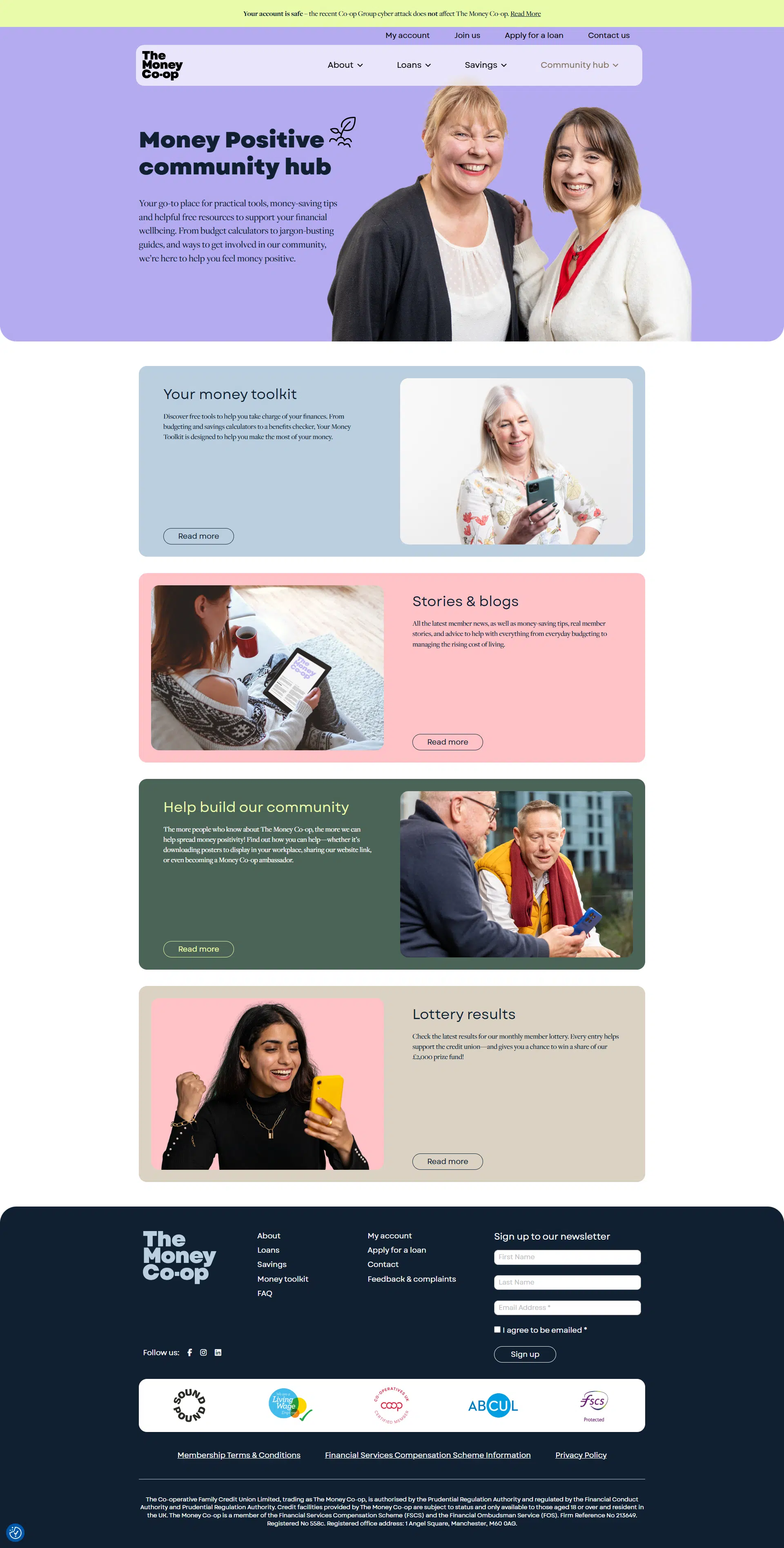
We worked closely with The Money COOP to lift the new brand onto the site. We coached their writer on how to thread the promise – ethical, easy, open to all – into every headline, intro and call‑to‑action. Each draft came back to us for tone checks, plain‑language tweaks and a final proofread, keeping the voice consistent and clear.
We also managed the visual and technical build. Our designers set up page templates that lock in the new colours, type scale and icon set, then handed tight specs to the developers. We checked progress regularly, fixing anything that drifted off‑brand. Mobile views, load speed and accessibility earned a final sign‑off before launch, so the refreshed Money COOP site looked sharp and worked fast from day one.
We planned every step someone might take—from Googling “What’s a credit union?” to becoming a member and telling their friends. We used our full communications plan to decide what to say, where to say it and when. That way, people see the right message at the right time, whether it’s on the website, in an email or on social media.
Think clear, sign-posted webpages, email flows that greet, guide and re-engage, plus a paid-media mix (Google, Meta, LinkedIn) that moves prospects from awareness to “join now.”
Behind the scenes we set up GA4 and Hotjar, flagged quick SEO wins and built an improvement backlog the team can chip away at. Segmented email automations, phased ad budgets and real-time analytics now work together like clockwork – raising awareness, nurturing trust and delivering a steady flow of new members.
The paid landscape had really changed since the organisation had last dipped their toes into some paid campaigns, so we took it right back to basics with an integrated, always on paid campaign.
We set up paid search and social campaigns, working those personas from the brand work and making sure we were connecting the right users, with the right messages, at the right time.
Then it was obout the fine tuning, shifting budgets, bids and audiences to squeeze out the best cost-per-click. Fresh visuals allow us to test format, messaging and creative styles at each funnel stage on a variety of target audiences. Tracking is rock-solid too: we watch it like a hawk and look for opportunities to improve and learn from our split testing efforts.
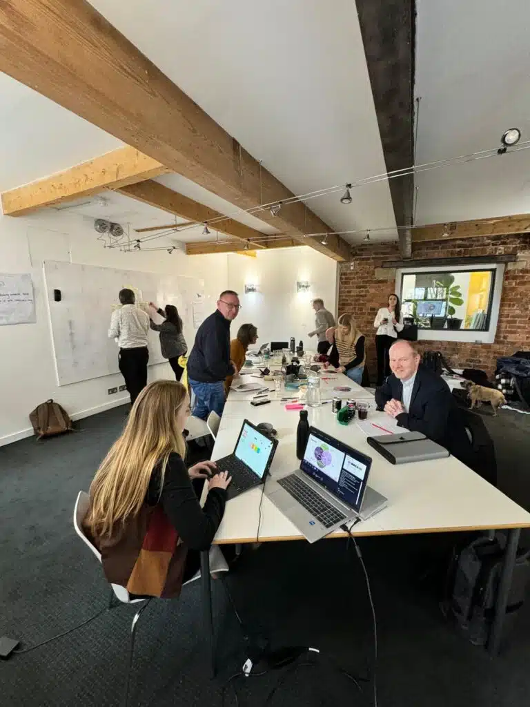
Our relationship with The Money Co-op has been all about collaboration and empowerment and campaigns were no different, the goal was always that these would be managed long term in-house. To that end, the internal team were with us every step of the way and alongside set up and management we ran a training and mentoring programme, meaning that when the time came to hand over the reigns they could keep achieving bigger and better results.
We created a series of educational blog posts for the launch campaign. What’s more, the Purpose Project Report was rebuilt into the new Money Positive Report: new cover, colours, member stories, blogs – the lot. We delivered a press-ready PDF plus editable files for easy updates.
Together with our digital consultant, AJ, we supported the team through a mix of in-person training sessions and informal mentoring. What started as a half-day workshop on Paid LinkedIn and GA4 grew into a more tailored approach, shaped by the team’s needs as their skills developed and the website project matured. They learned how to set up campaigns, read the numbers, build audiences, link GA4 to ads and set smart alerts. They left with a checklist – and the confidence to drive their own results.
We showed the team how to keep doing the work. Alongside the GA4 and LinkedIn workshop, we ran mini‑sessions on email automation, SEO housekeeping and on‑brand copy edits. Every tool came with a how‑to checklist and we’re on call for questions. The result: a team that can run, test and improve campaigns without waiting on us.
Brand choices had felt risky. Our discovery sprint laid out the facts – audience data, costs, and a channel‑by‑channel plan – so the board could see the whole picture in one meeting. They picked route two with full confidence. Seven days, decision done.
The new name and look went live. Because every piece was planned together, the switch felt seamless. The team call the process “a joy” and are proud of a brand that speaks to future members and the employers who back them. With clear guides for every channel, they now have the perfect foundation to keep membership growing under their own steam.
“Working with MP&Co on our rebrand, website and marketing strategy has been a joy. We are really proud of our new identity – The Money Co-op – and it wouldn’t have been possible without Mike and his fantastic team.
We began just wanting a website, but the team rightly challenged us to go back to our strategy before investing in an asset like a website and it was absolutely the right approach. By starting from what we’re trying to achieve and who we want to reach, we were able to arrive at a final result which is already really working for us with both our audience of potential members and, crucially, our employer partners.
MP&Co’s team are expert in the many disciplines required for modern marketing. From compelling design to engaging copywriting and up to the minute digital and web development. I can’t recommend them highly enough.”
Matt Bland, CEO of The Money COOP